


A forward-thinking company
JH Flemmings is a division of St James Place, one of the largest wealth management companies in the UK. Working in a traditional financial institution, JH Flemmings wanted to differentiate itself as the ultimate private office with a focus on enabling entrepreneurs, teams, and businesses to achieve their ambitions. They approached us to help capture and understand what makes them tick, why they do what they do, and what makes them special, then create a brand identity that’s functional and reflects the personality of the company, their ethos, and the people who work in it.
Project Scope
Brand Strategy,
Brand Development
Art Direction,
Copywriting,
Website Design
Client
JH Flemmings
Project Type
Brand Development


Core Principles
Working closely with the directors and senior management we developed three core principles that define their approach and how they engage with existing and potential clients. These principles would form the foundation for the re-brand and the brand strategy moving forward.


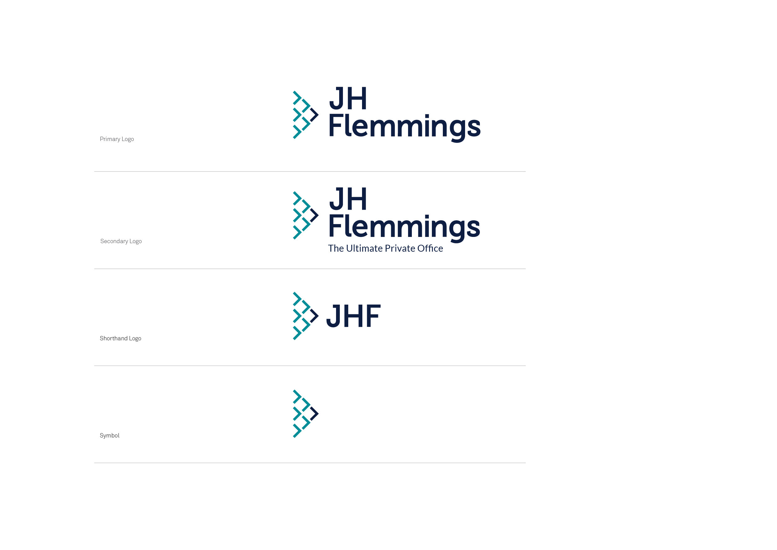
The Symbol
The JHF symbol is a physical representation of the company’s principles and its promise to its clients and employees. Always forward-thinking, made up of a cluster of arrows behind a single arrow which together forms one large arrow moving forward they are there to support you if you fall and are behind you all the way when you need a push to achieve your goals


As part of this project, we also developed distinctive brand identity for JHF Wealth, which is a sister company of JH Flemmings and serves as its wealth management division. Our efforts included designing a new logo that seamlessly integrates with the updated brand identity of JH Flemmings, ensuring a unified and professional appearance.
Additionally, we developed a new, user-friendly website tailored to meet the needs of JHF Wealth's clients. This was complemented by the creation of new client-facing documents, which were designed to reflect the fresh branding and to enhance client communication and engagement. This comprehensive approach was aimed at reinforcing JHF Wealth's presence in the wealth management sector, underlining its connection to JH Flemmings, while also establishing its own unique identity.


During this experience, we were more like a team than clients as Abuakwa immersed himself in what we do to fully understand our business which made the experience extremely beneficial for everyone in the company. Since the re-brand, we have seen on average, a 300% increase in the net asset value of the type of clients we are attracting. Internally we have been able to streamline our processes. Communication with our clients is now a lot more seamless.
Royden Greaves
Co-founder of JH Flemmings

